Skip to content
  • Home
  • Subscribe / donate
  • Events calendar
  • News
    • Local
    • National
    • Israel
    • World
    • עניין בחדשות
      A roundup of news in Canada and further afield, in Hebrew.
  • Opinion
    • From the JI
    • Op-Ed
  • Arts & Culture
    • Performing Arts
    • Music
    • Books
    • Visual Arts
    • TV & Film
  • Life
    • Celebrating the Holidays
    • Travel
    • The Daily Snooze
      Cartoons by Jacob Samuel
    • Mystery Photo
      Help the JI and JMABC fill in the gaps in our archives.
  • Community Links
    • Organizations, Etc.
    • Other News Sources & Blogs
    • Business Directory
  • FAQ
  • JI Chai Celebration
  • JI@88! video

Recent Posts

  • Eby touts government record
  • Keep lighting candles
  • Facing a complex situation
  • Unique interview show a hit
  • See Annie at Gateway
  • Explorations of light
  • Help with the legal aspects
  • Stories create impact
  • Different faiths gather
  • Advocating for girls’ rights
  • An oral song tradition
  • Genealogy tools and tips
  • Jew-hatred is centuries old
  • Aiding medical research
  • Connecting Jews to Judaism
  • Beacon of light in heart of city
  • Drag & Dreidel: A Queer Jewish Hanukkah Celebration
  • An emotional reunion
  • Post-tumble, lights still shine
  • Visit to cradle of Ashkenaz
  • Unique, memorable travels
  • Family memoir a work of art
  • A little holiday romance
  • The Maccabees, old and new
  • My Hanukkah miracle
  • After the rededication … a Hanukkah cartoon
  • Improving the holiday table
  • Vive la différence!
  • Fresh, healthy comfort foods
  • From the archives … Hanukkah
  • תגובתי לכתבה על ישראלים שרצו להגר לקנדה ולא קיבלו אותם עם שטיח אדום
  • Lessons in Mamdani’s win
  • West Van Story at the York
  • Words hold much power
  • Plenty of hopefulness
  • Lessons from past for today

Archives

Follow @JewishIndie
image - The CJN - Visit Us Banner - 300x600 - 101625

Tag: Zack Gallery

Art as a form of storytelling

Art as a form of storytelling

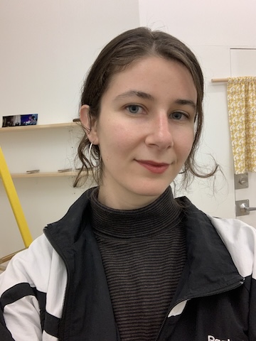
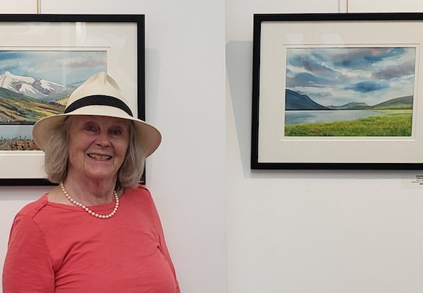
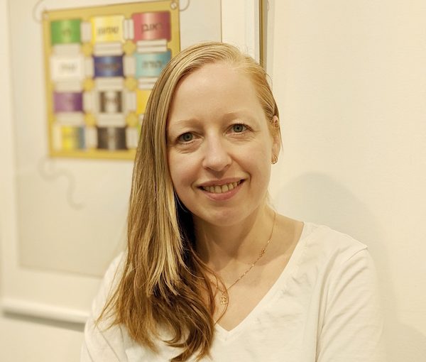
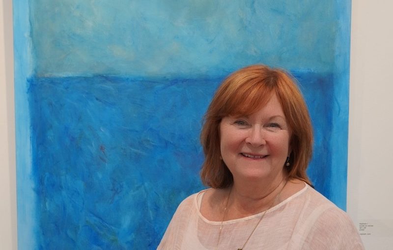
Sarah Dobbs is the new manager of the Sidney and Gertrude Zack Gallery at the Jewish Community Centre of Greater Vancouver. (photo from Zack Gallery)\

The Sidney and Gertrude Zack Gallery has a new manager, Sarah Dobbs, who showed an early affinity for her chosen field.

“My first time as a gallery host happened when I was about 8 years old,” she told the Independent. “My father was a journalist and a travel writer, and we lived in many countries when I was young: Spain, France, Morocco. Everywhere, my parents took me to art galleries, and I loved it.

“In the 1960s, while we were in Mexico, we often went to the local market. My father bought colourful folk sculptures. It was long before they became popular, we started collecting them. After we returned to Toronto, my family decided to have an exhibition of our collection. I was there, too. I enjoyed talking to people who came to see the show. I told them stories about this sculpture and that one. I liked sharing another culture with the people in my city. This entire experience had a huge impact on me. Even though I was young, I realized that art was storytelling. Art reflects our understanding of people and cultures.”

After receiving her degree in art history from the University of British Columbia and a master’s of education from the University of Toronto, Dobbs worked in the art world for more than 30 years.

“I ran commercial galleries and public galleries,” she said. “In the mid-’90s, I opened my own gallery, where I displayed mostly abstract art. I love abstract. Anyone can read their own story in an abstract painting.”

One of Dobbs’s most interesting projects happened when she was the director of the Burnaby Art Gallery.

“Part of my job there was to increase our interactions with the community,” she 

explained. “I started an outreach program for people who would never go to an art gallery on their own, specifically youths right out of jail. They were young. Most of them had yet to graduate from high school. We gave them disposable cameras and suggested they take photos of what was important in their lives (but not drugs). Then they would do collages of their photos and we displayed those collages in local bus shelters. Those collages reflected the teens’ lives, perhaps helped them to come to terms with it. The collages were also an opportunity for all of them to share their lives and their concerns with the wider public. I’m proud to say that all of our participants graduated from high school.” 

Projects like this, integrating art and public awareness, have accompanied Dobbs throughout her career. From 2002 to 2008, she worked in Ireland, at the National Gallery of Ireland and at the Irish Museum of Modern Art.

“We worked with hospital patients, but it wasn’t art therapy,” she said of that experience. “It was just doing art, participating. It reminded sick people of their healthy selves.”

Everywhere she has worked, Dobbs has helped people tell their stories through art, helped them deal with their suffering.

“In 2004, I was invited by a nurses’ charity to go to Sri Lanka for five weeks, to help the tsunami victims,” she recalled. “So many died there, children, old people. So much pain. I tried to do what I could to help, to ease that pain – I brought 98 kilos of art supplies with me.”

Later, in Kenya, she lived in a women’s peace-building village for a time.

“There were women from different tribes there, the tribes that were at war, that committed atrocities towards each other. But those women tried to build peace,” said Dobbs. “We would sit together and share stories. When women from different tribes saw similarities in their stories, felt their stories resonate with everyone, it helped in the peace-building process.”   

Dobbs has curated about 200 art exhibitions. In her opinion, deep knowledge of the art world is only part of being a successful curator.

“Of course, you have to be passionate about art,” she said. “But you also have to be very organized. You need to be patient with the artists – they are very sensitive. Encouraging artists, especially young artists, boosting their confidence is paramount. It helps them tell their stories. And you also need to be aware of who is going to see the art – to keep balance between artistic expression and public understanding. Sometimes, the latter could be a challenge. Another ongoing challenge is convincing people that art has value.”  

Those challenges can be exhausting, and even a successful art curator occasionally needs a break. Dobbs took such a break during the pandemic. The timing made sense, as most public spaces closed in 2020.

“For three years, I ran an integrated clinic, including traditional medicine, a naturopath, a massage therapist, etc. A break is good,” she said, “but I always come back to art. Sharing art with everyone is my joy.”

That’s why when the JCC announced that the Zack Gallery needed a new manager, she applied for the position.

“I have known about the Zack Gallery forever,” Dobbs said. “It is a wonderful place, a blend between a public gallery and a commercial art space. The gallery runs community exhibits. There is a theatre next door, which brings people in before the shows and during the intermissions. Children come in often. That is how art education starts for most of us, when a child wanders into an art gallery.” 

Olga Livshin is a Vancouver freelance writer. She can be reached at [email protected].

Format ImagePosted on July 26, 2024July 25, 2024Author Olga LivshinCategories Visual ArtsTags art, Sarah Dobbs, tikkun olam, Zack Gallery
Pride in his Jewish identity

Pride in his Jewish identity

Brian Gleckman in front of his work, “The Judgment of Solomon (Psak Din: Judgment).” Psak din is a ruling given by a beit din, a Jewish court. (photo by Olga Livshin)

Brian Gleckman’s first show at the Zack Gallery, Abstracted Identity, opened on June 18. 

The artist has loved art since childhood. “I grew up in Los Angeles,” he said in an interview with the Jewish Independent. “It is a vibrant city for visual arts. There are an endless number of art galleries and museums, and I was always there. And, of course, I always drew and painted.” 

After getting his degree in visual art and history from California State University, Gleckman traveled extensively around Europe, before settling in Vancouver more than 30 years ago. But traveling has remained his passion and, during his travels, he invariably focuses on art and art history, museums and galleries. 

“When I first visited Europe, I fell in love with Rococo and Baroque,” he said. Baroque and Rococo are both highly ornamental styles, which infused the art and architecture of post-Renaissance Europe.

Later, he drifted towards more contemporary styles, both as an art connoisseur and in his own work. “I suppose I can call my art abstract expressionism,” he said.   

“Colour for me is a vehicle that allows me to play with shapes and space,” Gleckman explained. “Spatial relationships and composition of the images are of the utmost importance to me. I’m also concerned with depth and texture. I aim to create visual tension in my paintings. I think art shouldn’t be too easy or too comfortable. I want my viewers to engage, to ask questions. ‘What did he mean by that?’ ‘How does it make me feel?’ My viewers might not arrive at the same inner realization I conceived, but their explorations are more important than my answers. When people interact with my art, they become part of the creation process.” 

With his current show, Gleckman seeks to “portray things that lie beyond the tangible – that is, beyond the figurative, beyond the readily recognized narrative. The paintings in this exhibit are expressions of the inspiration I derive from biblical stories, religious thought, as well as rudimentary ideas within kabbalah. Selected from the portfolios of my professional artwork, these paintings are reflections of how I personalize the intangibles of Judaism.… These paintings are abstractions of my Jewish identity, an identity that is the product not so much of formal religious practice but the summative effect of intellectual and emotional sensibilities of my Jewishness.”

Of course, the Jewish Community Centre of Greater Vancouver, which is home to the Sidney and Gertrude Zack Gallery, felt like the perfect venue for such a show, but there was an additional reason why Gleckman wanted to exhibit at the Zack. 

“After Oct. 7, I wanted to do something that had meaning,” he said. “I wanted to share my pride in my Jewish identity. At the same time, I wanted to be part of the effort to help Israel, to make my own contribution. But I am an artist. I create art. I thought maybe my art could inspire someone to do something for Israel, to help in some way.” 

He approached the gallery with the idea of a show and offered to donate any proceeds from the sales of his paintings.

“I’m going to donate whatever I get to two organizations: ASI-Canada (Association for the Soldiers of Israel), which supports active-duty IDF soldiers, and Magen David Adom, which is Israel’s emergency response service. To promote the sales, I’m also offering 30% discount off my website prices for all my paintings.”    

The exhibit comprises 27 paintings from several of Gleckman’s established series. “For this exhibition, I have included paintings that are accompanied by titles … for fuller comprehension,” he said.

“The titles invite viewers to search for and reflect on the nuances of their own understanding of the selected stories, themes and ideas,” the artist explained. “I’m not trying to dictate my own interpretations to viewers. Instead, with the titles, I try to nudge viewers in the right direction. The titles are sort of guidelines for understanding the images, their conceptual representation.”

image - “Yerushalayim (Jerusalem)” by Brian Gleckman. The Hebrew words in the painting are from Psalm 137: “If I forget you, O Jerusalem, may my right hand forget ...  if I do not bring up Jerusalem at the beginning of my joy.”
“Yerushalayim (Jerusalem)” by Brian Gleckman. The Hebrew words in the painting are from Psalm 137: “If I forget you, O Jerusalem, may my right hand forget …  if I do not bring up Jerusalem at the beginning of my joy.”

Most of the titles are in Hebrew, spelled phonetically in the English alphabet. Some are in English, but they represent Jewish customs and stories. For example, the large painting “Tikkun Olam” is a field of life-affirming blue, while “Shiva” is bleak and dark, a painting of grief and despair, but both will generate different feelings for everyone.

A few other paintings are linked to grief and death, but many sport bright colors, like “Aytz Chaim” – blue and gold and triumphant – which proclaims the artist’s vision of the Tree of Life. The painting, tall and narrow, is framed by golden words. 

Another tall and narrow painting, “Tefillah” (a prayer), contains this one word in Hebrew, as well as 10 bright gold stars dancing on the blue background below, representing a minyan, the quorum of 10 men (in Orthodox Judaism) or people needed for Jewish communal prayers.

Another painting with words and colours woven together is “Yerushalayim.” Its golden-brown palette is reminiscent of the ancient city of Jerusalem, its modernity and its millennia of history, including conflict.   

Then there are calligraphed Hebrew letters, each magnified manifold on its own black and white canvas. “Their shapes are still recognizable,” said Gleckman, “but I wanted to explore the possibilities, the situation where something we know becomes something else, something to investigate and find a new meaning.” Each of these letter-paintings is like a road, curling capriciously according to the letter’s design, leading the viewers towards the unknown. 

Abstracted Identity runs until July 18. To learn more, visit the artist’s website, briangleckman.com.

Olga Livshin is a Vancouver freelance writer. She can be reached at [email protected].

Format ImagePosted on June 28, 2024June 27, 2024Author Olga LivshinCategories Visual ArtsTags Abstracted Identity, ASI-Canada, Brian Gleckman, fundraiser, identity, Israel, Judaism, Magen David Adom, painting, philanthropy, Zack Gallery
Art helps bring us together

Art helps bring us together

The current show at the Zack Gallery, Community Longing and Belonging, brings together a range of artists and styles. Pictured here is Alejandra Morales’s “A Landscape of Consumable Dreams.” (photo by Olga Livshin)

The current show at the Zack Gallery, Community Longing and Belonging, which opened Feb. 21, is the sixth annual exhibition in celebration of Jewish Disability Awareness and Inclusion Month. 

The exhibit was organized by the Jewish Community Centre of Greater Vancouver’s Inclusion Services and curated by Shelly Bordensky, the program’s coordinator. Most participating artists are either members of the JCC program or similar ones in other localities, like Aspire Richmond. These initiatives support people with developmental disabilities through various creative endeavours. 

The Zack show’s creative displays consist of paintings and pottery. While the size, media, colour palettes and framing of the works are all different, the underlying theme is the same: we all want to belong, we are all together on this planet.

Two paintings reflect that theme not only in their content and method of execution, but in their titles as well: “All Together 1” and “All Together 2.” Both works are cheerful and colourful, rendered with the abandon of the primitivism style. Cats and birds frolic on the canvas without regard for one another or for rules of perspective. Both list the artist as Art Hive, the visual art division of JCC Inclusion Services.

Bordensky told the Independent that both paintings were group pieces, created by several people. “Each artist added an element – a cat or a bird – and our wonderful art instructor, Kim Almond, made sure they all matched in style and colours.”  

According to Almond, 13 artists, all members of Art Hive, participated in each painting.

“Mark Li and Andrew Jackson started off the two collaborative paintings for the group, and it was a great project to work on as a class,” she said. “Colours were a huge part of the process, as the artists were always striving to create that special pop of colour.”

Another example of group art is the pottery creations – playful little animals, solemn hamsas (hands) and juicy pomegranates – crowding several stands around the gallery. 

“These ceramic pieces are all Raku ceramics by the pottery artists who are members of our Art Hive,” said Bordensky. “Together, we can create so much.”

Individual artists’ paintings are also on the theme of community.

Alex Lecce’s untitled piece is a slice of a neighbourhood street with a pie shop. The colours are realistic, and the image captures a quiet, everyday moment. We all go there, the artist seems to say. Those pies make our lives happier and more flavourful. They unite us in our humanity. 

On the other hand, Alejandra Morales’s painting, “A Landscape of Consumable Dreams,” is jarring in both the colour palette and the structure. This painting screams of discord. There are two disparate parts in the image. The top part is a tangled bunch of flowers, all in beautiful, greyish lilac hues, intertwined and elaborate. The bottom part is a vague human figure bowing to the pretty flowers. The colours of the figure are harsh, grating; they don’t fit with the flowers. But the figure obviously wants to fit, just as we all want to fit in with our surroundings. The complexity of the juxtaposition of humans versus nature is unmistakable.

Other paintings are not as complicated. Mami Zimmerman’s “Best Friends” features two ponies. Its simplicity is charming and lovely. We all want such friends. 

image - Mami Zimmerman’s “Best Friends”
Mami Zimmerman’s “Best Friends” (photo by Olga Livshin)

Calvin Ho’s painting “Nuts” is another example of primitivism in the show. The bright depiction of a squirrel and a woodpecker is reminiscent of picture books from our childhood. Bold lines and primary colours underscore that feeling. The two creatures are playing tug with a nut. Or maybe they are sharing it. Or fighting over it. The innocence of the picture invariably induces a smile.

image - Calvin Ho’s “Nuts”
Calvin Ho’s “Nuts” (photo by Olga Livshin)

In contrast, Merle Linde’s powerful landscape – “BC Wildfire 2023” – doesn’t invite smiles. The painting, its red and black scheme grim and scary, reminds us of the horror of the wildfires that affect our forests every year. The tragedy implied in the painting unites us, just as the sweeter emotions in other images do. 

In a telephone interview with the Independent, Linde said: “I’ve always enjoyed art, from the day I could hold a pencil. I liked going to art shows, too.” Mostly self-taught as an artist, she said she only started painting seriously after she retired. 

Judaica is one of the directions she explores in her art. To date, the Independent has used two of her paintings for its cover: for the 2023 Passover issue and for the 2022 Rosh Hashanah issue. Occasionally, she teaches classes for seniors in various artistic techniques.

Merle Linde’s “BC Wildfire 2023” (photo by Olga Livshin)

“Acrylic pour is a fascinating technique,” she said. “You pour the paint and let it spread as it will without a brush, and then wait till it dries. That was what I did for the background of the ‘Wildfire’ painting. I made it a few years ago. When I saw the news about the wildfires last summer, I picked up a brush and painted the black burned-out tree skeletons on top. I have two such paintings, but there was only space for one in the Zack show.”  

Most of the paintings in the show express themselves at first view. However, Gail Rudin’s “Out for the Hunt” raises questions. It portrays four seemingly perky owls on a merry, greenish background. One could assume a light-hearted company of friends on an outing, until one notices a line of tiny mice scurrying away in terror in the very bottom of the picture. Suddenly, the entire image changes its meaning, illustrating the unavoidable conflicts within nature, where the hunters and the hunted coexist. Despite the constant danger of the wild, nature somehow always finds its balance. Maybe, as humans, we could take lessons from that.     

Community Longing and Belonging is on display at the Zack Gallery until April 2. 

Olga Livshin is a Vancouver freelance writer. She can be reached at [email protected].

Format ImagePosted on March 8, 2024March 7, 2024Author Olga LivshinCategories Visual ArtsTags Community Longing and Belonging, inclusion services, JCC, Jewish Community Centre of Greater Vancouver, Merle Linde, painting, sculpture, Shelly Bordensky, Zack Gallery
Sculpturing with wood

Sculpturing with wood

“Constellation” by Rosamunde Bordo. (photo by Sol Hashemi)

Every true artist at the start of their career undergoes a period of intense search: for their voices, for their themes, for their artistic expressions. Rosamunde Bordo is at that exciting stage now. She is searching. Her show at the Zack Gallery, Morning Star, reflects her creative explorations. 

A professional artist today, Bordo has always loved art.

“As a child, I went to a school with a strong art program. I painted. I played saxophone. My parents always encouraged my interest in art,” she said in an interview with the Independent. 

photo - Rosamunde Bordo’s solo exhibit, Morning Star, is at the Zack Gallery until Feb. 7
Rosamunde Bordo’s solo exhibit, Morning Star, is at the Zack Gallery until Feb. 7. (photo from Rosamunde Bordo)

After a bachelor’s in liberal arts and print media at Concordia University in Montreal (2014) and master of fine arts degree in visual art at the University of British Columbia (2020), Bordo teaches printmaking at UBC. But her artistic interests range much wider than printmaking. Her newly emerging passions include the creation of installations and woodworking. 

“I started woodworking last spring,” she said. “In this show, I use different woods: maple, cherry, walnut. I’m fascinated by the process of turning wood into sculptures. In a way, woodworking is similar to printmaking. Both use technology but, unlike two-dimensional printmaking, woodworking offers three dimensions. In woodworking, I try to find the story of the material, try to immerse in material-based research to investigate the self as a created subject.”

Bordo began woodworking when she started her ongoing installation project, The Denise File.

“It is almost a work of detective fiction, written through physical space,” she explained. Using found postcards written to someone named Denise, Bordo “wanted to reconstruct who the elusive Denise is, to figure out what the letters meant, to show her essence through objects, sculptures and drawings.”

She built some wooden furniture for The Denise File – a screen and a chair – and wanted to do more, to explore all she could do with wood. Her current show, comprised mostly of several sculptures, has its roots in a Jewish magic class she took at her synagogue in 2021.

“I wanted to understand Jewish history, its mysticism and its superstitions,” she said.

Each figure on the gallery wall could have originated from the ancient writings of many nations.

“It could be ancient Hebrew or Aramaic or even Greek,” Bordo mused. “All the cultures in that region were interconnected. I see the entire show as a healing amulet, but I didn’t want to assign my own meanings to the individual figures. I wanted them to be mysteries for my viewers to investigate. I wanted the viewers to be detectives and I didn’t want to influence them with my personal vision, didn’t want to limit their imagination.”

That’s why she titled every “Constellation” figure with a number. “They could be stick figures – they are very simple – but I see them as constellations, stars connected to each other,” she said. “That’s why the show is called Morning Star. The world is a difficult place right now, and the morning star is a symbol of renewal.”

Bordo’s constellations are deceptive, looking a bit like wooden hieroglyphs, or perhaps molecular structures, each with its own character.

“The one with a leg sticking out of the wall – it wanted to be playful, maybe escape from the wall,” she said. “I was looking for harmony when I worked on them, but I didn’t want to force them into locked shapes. I wanted to give them their own personalities. Besides, I try to respect the wood I work with. It is alive. There are many ways one could interpret a wooden sculpture.”  

In addition to the constellations on the gallery walls, there is also a video called Potion, which comprises four minutes of rotating green abstract patterns. Postcards with a single image from the video form another part of the installation. The text on the back of the postcards reveals the artist’s motto for this show: “Ideas are to objects as constellations are to stars.”  

There is also a small table with a slab of pink salt on it.

“Placing salt in your pockets and in the corners of rooms was a well-known Jewish superstition to ward off malevolent spirits,” Bordo said. The table with the salt stands in the corner of the gallery, hopefully repulsing malice. We all need that in our troubled times, she explained.

The show opened Jan. 5 and will be on display until Feb. 7. To learn more, go to the artist’s website, withoutimages.com. 

Olga Livshin is a Vancouver freelance writer. She can be reached at [email protected].

Format ImagePosted on January 12, 2024January 10, 2024Author Olga LivshinCategories Visual ArtsTags Rosamunde Bordo, sculpture, The Denise File, woodworking, Zack Gallery
Share delight of letters

Share delight of letters

“Shabbat Saskatchewan,” by Esther Tennenhouse. Part of Otiyot (Letters), a joint exhibit with her son Joel Klassen, which is now at the Zack Gallery.

Colourful and playful, dark and ominous, Esther Tennenhouse’s artwork is engaging and thought-provoking, as she offers her take on Torah and midrash, immigration and language, orthodoxy and modernity. Otiyot (Letters), an exhibit she shares with her son Joel Klassen, opened at the Zack Gallery last week.

Tennenhouse’s sense of humour, curiosity, imagination and sincerity come through in the work on display, and in her responses to questions about the exhibit.

“Ot means ‘letter’ (of the alphabet) – it also means ‘sign’ and ‘signal,’” she told the Independent. “It was my first choice of name for the show: Ot – Starring the Letter Shin. Sounds like ‘ought,’ as in ‘thought.’ Ot was visually terse (and sounds adorable). That was why it was Ot in [the] JCC program book – I had to provide that bit before these pieces were made! Yikes! But it got changed to the longer plural in Hebrew and lost its zap. More truthful, though, as I have so many (too many) words of explanation on the wall beside each piece.”

All the works were made specifically for the exhibit, said Tennenhouse, “only for this place, for anyone who happens to walk into the JCC,” where the Zack Gallery is located.

“I was driven by my own relationship to the alef-bet: me, a quite secular, second-generation, Winnipeg-born Jew living in Vancouver, of prairie-born parents, who learned my aleph-bet as a child, quite long ago. I think many like me, with my sort of education, walk by these gallery doors, so I thought they might wander in and relate.”

Born and raised in Winnipeg, Tennenhouse went to Talmud Torah there from age 4 to 11, then to public school. She earned a bachelor’s in English and, while working at the Winnipeg Free Press, majored in sculpture at the University of Manitoba School of Art.

She moved to Aklavik, in the Inuvik region of the Northwest Territories, and then to Yellowknife, where she learned about ceramics at the Yellowknife Guild of Arts and Crafts. She later worked with translucent clays.

Moving with her family – husband Ron, son Joel and daughter Timmi – to Vancouver in 1995, Tennenhouse found a home at Or Shalom, participating in the Talmud and Torah study offered there, reengaging in Jewish education after a break of some 45 years.

Klassen also attends Or Shalom. His art background includes having drawn at home and working with painter Sylvia Oates – who he describes as a mentor – in her Parker Street studio. Klassen has had a one-man show in artist Noel Hodnett’s Parker Street studio, and he was in the Kickstart Disability Arts and Culture’s 2019 group show Nothing Without Us at the Cultch. For the past four years, he has attended the JCC’s Art Hive, which is facilitated by Kim Almond.

Klassen’s Hebrew letters and drawings are in five of the pieces at the Zack Gallery, said Tennenhouse.

“Making letters as individuals, each with their own character, was the most fun to do,” she said. “Jan Wilson, a friend and quilter, offered to help if I drew out the correctly sized letters backwards for transfer and picked the fabrics.”

The letters comprise eight of the works on display, and offer much to think – and smile – about. Klassen’s aleph is filled in with leopard print fabric, surrounded in black with a flowered border. The word “wild” comes to mind as one looks at it, not just the wildness of animals and nature, but of human beings. The piece is called “Aleph in the Garden.”

photo - “Aleph in the Garden” by Esther Tennenhouse, Joel Klassen and Jan Wilson
“Aleph in the Garden” by Esther Tennenhouse, Joel Klassen and Jan Wilson.

“I did not shy away from diversity,” said Tennenhouse. “It’s sort of an underlying element. I felt the show had to offer something to any individual, whatever their history with the alef-bet, and it deals with very well-trodden themes. I felt a need for an element of surprise, which is one reason why Joel’s aleph became a leopard in the garden (of Eden?).”

A last-minute addition to the depictions is one of the 12 new letters for gender-neutral word endings that were created by Israelis graphic designer Michal Shomer a few years ago.

“They appeared in welcome signs outside schools and on IDF buildings, etc., but the kabbalist idea of the power of the alphabet lives on – the new letters were vigorously rejected by religious factions,” said Tennenhouse. “‘Changing the letters removes any kedusha (sanctity) the words have or any ability the words have of channeling God’s energy into the world,’ said sofer Rabbi Abraham Itzkowitz. ‘This project essentially makes Hebrew like any other language.’ Some of the signs were taken down. Religious schools were forbidden to use them.”

That said, Tennenhouse told the Independent, “What first tickled me into this aleph-bet project was the poetry and passion of the ideas of the early mystics. They conceived of letters of the alef-bet existing even before the creation of the world – all 22 were vessels of the divine, all things were created by their combinations. Meditative/ecstatic kabbalah taught that individual letters were something to meditate upon, which led to ecstasy, one of the steps to sense of union with G-d. American calligrapher Ben Shahn, who titled one of his books Love and Joy About Letters, quotes the 13th-century Rabbi Abulafia, who said the delight in combining letters is like being carried away by notes of music.”

Tennenhouse and Klassen’s “Shir” (song, poetry, chant, in Hebrew) is truly delightful, like a page out of a children’s book. A multimedia piece, it depicts several animals and the sounds they make, both in Hebrew and in transliteration, though the giraffe just “hum[s] at night.”

Two other works are striking, both on their own and in contrast to each other: Sinai 1 and Sinai 2.

photo - Detail of "Sinai 2" by Esther Tennenhouse and Joel Klassen
Detail of “Sinai 2” by Esther Tennenhouse and Joel Klassen.

The latter features three bright yellow flowers, surrounded by green. “It is a triangle canvas which is about the mountain bursting into bloom when Moses came down with the Ten Commandments – this was a midrash from the 1500s. The triangle has flowers by Joel. I asked him to put flowers on it, envisioning little flowers here and there – he just went swoosh woosh on it.”

Sinai 2 is a vertical rectangle with whites, greys and blacks depicting a furious ball of activity on top of the mountain that includes the Hebrew letters.

photo - "Sinai 1" by Esther Tennenhouse
“Sinai 1” by Esther Tennenhouse.

“The Torah tells of fear, awe, the shaking mountain, seeing sounds, lightning, Moses’ anger, the breaking tablets,” said Tennenhouse. “Looking back, I overburdened the canvas [with] anger, though laying on the 231 Gates – a diagram from the Sefer Yetzirah which shows each letter combining with each other letter of the alef-bet – because I see the story of the giving of the Torah as a sort of creation story for our intense embrace of literacy. The diagram relates to Rabbi Abulafia’s talk of combination of letters but distracts visually from the anger/violence, [the] mountain, fear.”

There is so much more in this exhibit.

“Cursive Handwriting: Kovno Testament” is a stark, unfinished work, featuring the words, written in his own hand, of Lithuanian writer Eliezer Heiman, who died in the Kovno ghetto during the Holocaust. It was to have three more samples of cursive, said Tennenhouse. “I left room for them before I put on the image of Heiman’s tablets. Those spaces stayed empty. Everything else edited themselves out because of what happened in Israel on Oct. 7.”

There is the multimedia triptych “Shabbat Saskatchewan,” which Tennenhouse said “is me trying to use real photos and documents to create some presence of my mother’s grandparents and parents.”

“It ended up being centred on great-grandmother Esther Dudelzak Singer, Baba Faige (Fanny) Singer and my mother with her sisters,” she said. “Yiddish was their mamaloshen (mother tongue) and the Sonnenfeld community was religiously observant.”

“The Owl and the Pussy Cat” adds colour and vibrancy to Edward Lear’s black and white drawing of his nonsense poem, the Yiddish translation of which – by the late Marie B. Jaffe – fills the two side panels of this triptych. Tennenhouse couldn’t find much information out about Jaffe, she said, “But, thanks to Eddie Pauls at the Jewish Public Library in Montreal, [I] learned she immigrated to New York in 1909 from Lithuania.”

Tennenhouse began to see the owl and the cat in their boat as sailors braving the rough seas, traveling around the world to find “Di Goldene Medine,” “the Golden Land,” America.

“You might say ‘Saskatchewan,’ too, is about leaving home, traveling across seas and finding a new place but keeping your language and culture,” said Tennenhouse.

Otiyot (Letters) is on display at Zack Gallery until Nov. 12.

Format ImagePosted on October 27, 2023October 26, 2023Author Cynthia RamsayCategories Visual ArtsTags art, Esther Tennenhouse, Joel Klassen, multimedia, Otiyot, painting, Zack Gallery
Tell your own “crankie” stories

Tell your own “crankie” stories

Where Do Stories Come From? (fun vanen nemen zikh di mayses) on Nov. 9 highlights a poem from each of three Yiddish women writers: Ida Maze, Esther Shumiatcher-Hirschbein and Yudika. (Illustration by Cesario Lavery)

This year’s Chutzpah! Festival includes several opportunities for people to participate in the arts being performed. A prime example is Where Do Stories Come From? (fun vanen nemen zikh di mayses), wherein attendees of the Nov. 9 event at the Rothstein Theatre will be able to learn new music inspired by Yiddish poetry and, in the Zack Gallery, on Nov. 7 and/or Nov. 12, participate in a “crankie” workshop.

Where Do Stories Come From?, which is presented by the Chutzpah! Festival and KlezKanada – co-curated by the organizations’ respective artistic directors, Jessica Mann Gutteridge and Avia Moore – includes “new musical and visual settings for three Yiddish poems by celebrated Canadian women writers, selected and translated by Faith Jones, with accompanying visual artwork in the form of ‘crankies’ – a centuries-old art form in which an illustrated scroll, evocative of the Torah, is wound across spools set in a viewing window.”

The artistic directors decided early on to work with the poetry of Canadian women writers who wrote in Yiddish, said Gutteridge, “and there was no more perfect collaborator to work with on selecting the poetry than Vancouver’s own Faith Jones. For the musical work, we drew on the incredibly rich community of KlezKanada’s artists and were lucky that Sarah Larsson was interested in the project – she’s not only a gifted composer with a thorough knowledge of Yiddish music, but is herself a stunning vocalist and music director.

“We also spent a lot of time looking at incredible artworks by Jewish visual artists and ultimately selected Benny Ferdman, Ava Berkson and Cesario Lavery, all of whom bring an interest in Yiddish, diverse styles, and interest in visual storytelling to the project. As part of the project involves community participation, we also ensured that all the artists are skilled at and enjoy working with community of all abilities and ages.”

The idea for the event came after Gutteridge met Moore at a KlezKanada Summer Retreat in 2022.

“When the JCC Association announced they would be funding new community-based projects incorporating live music and storytelling with an emphasis on partnerships,” said Gutteridge, “we realized we had a wonderful opportunity to work together to share our assets – KlezKanada’s immersive creative residency environment and access to brilliant artists with knowledge of Yiddish culture, and the Chutzpah! Festival’s presentation opportunities.

“KlezKanada’s 2023 Summer Retreat theme was Yiddish film and, because it’s a very unplugged environment, had plans to explore the ‘pre-film’ illustrated story technique of crankies,” she continued. “We thought this art form would pair beautifully with the musical work being created, and would offer a very engaging opportunity to the community to participate in creating a multidimensional presentation together.”

Where Do Stories Come From? is supported by the JCC Association’s Making Music Happen program and Chutzpah! Festival’s music programming is supported by AmplifyBC’s Live Music Presentation Fund.

The event’s title comes from one of the three poems highlighted, one by Ida Maze. “It’s a poem that grabbed the entire group immediately and we knew we wanted to work with it,” said Gutteridge. “In the poem, Maze creates a strong visual image of a little house that appears to be abandoned, but as you approach you see that a fire is lit and, in the house, sit a grandfather and a grandmother sharing culture and stories with the children, and the stories are then carried away on the wind. For us, this poem really captured the idea of the project – that intergenerational cultural transmission is the key to how we survive and thrive and, in many ways, is a model for how we hope to see this project unfold. But I think the very notion that we pose this as a question invites everyone who experiences the work to ask themselves where they think stories come from.”

The other poems are by Esther Shumiatcher-Hirschbein and Yudika.

“Faith made a longer list of poems selected for their striking visual imagery and potential musicality and presented them to our full group of artists,” explained Gutteridge. “Right away, we all responded to the Ida Maze work and had to then narrow our choices to two more. We asked the artists to highlight which poems they found particularly inspiring and, as artistic directors, Avia and I also kept an eye on whether the selections were creating an interesting and balanced program in terms of style and theme. It was an enjoyable and smooth process and I think we all enjoyed kicking off the project together in this way.”

As for the workshops, Gutteridge said, “Ava and Cesario will be with us through the week to guide workshop participants through the process of making their own crankies, inspired by prompts from the poetry we will provide. While the crankies being made for the music event will be large scale, a wonderful characteristic of this art form is that it can be made any size using very humble materials like a shoebox or even a matchbox. With our partner the Zack Gallery, the work created in the workshops will be on display in a community exhibition, and our video director Flick Harrison will be on hand to help participants capture their crankies in action. Participants can opt to share their crankies and stories in an online video gallery. We hope we will see intergenerational groups making crankies together!”

During the week, Chutzpah! will also be hosting the return of the Flame, with their evening of storytelling on Nov. 6.

“The Flame’s artistic director, Deb Williams, will teach her remarkable day-long storytelling workshop on Sunday, Nov. 12, ending just before our final crankie workshop and the concert presentation,” said Gutteridge. “We hope that these projects together will inspire community participants to explore their own stories and find new and inspiring ways to tell and share them.”

For tickets to Where Do Stories Come From? and other Chutzpah! events, visit chutzpahfestival.com.

Format ImagePosted on October 12, 2023October 12, 2023Author Cynthia RamsayCategories Performing ArtsTags Chutzpah!, film, Jessica Mann Gutteridge, KlezCanada, Rothstein Theatre, storytelling, workshops, Yiddish, Zack Gallery
Zack exhibit celebrates nature

Zack exhibit celebrates nature

Enda Bardell (photo from Enda Bardell)

Creativity manifests itself in people’s lives in different ways and at different times. For Enda Bardell, various forms of art occupied her for decades, while Mike Cohene discovered woodcarving only a few years ago, on his way to retirement. Their double show, Artistry in Wood and Water, opened at the Zack Gallery on July 26.

Bardell told the Independent that she was born in Estonia. In 1944, when she was a young child, her family fled from Estonia, then occupied by the Nazis, to Sweden. Her mother worked at a paper factory there, and Bardell played with paper dolls she made herself. She also drew all the dolls’ colourful outfits. “I gave the dolls away to other girls, to make friends,” she recalled. “My first attempts at fashion design.”

A few years later, the family was forced to move again. The Russian communist government wanted the return of all the Estonians who had escaped the Nazis during the war, and Sweden was going to comply with that demand. But Bardell’s father didn’t want to live in communist Russia, so they became refugees again, this time ending up in Canada.

“In 1951, we came to Winnipeg,” said Bardell. “I went to school there and I desperately wanted to fit in. To belong. To be Canadian. I participated in many school clubs and activities. Entered an art class, too. My teacher praised me and recommended that I send one of my drawings to an interschool art competition. I did. And I won. I knew then that I was an artist.”

Interested in landscapes and abstracts, Bardell painted a lot as a teenager, but, after her high school graduation, she became deeply involved in fabric art. “I sold my batiks at craft fairs and house parties. People liked them, and someone suggested I should open my own store,” she said. “I did. I designed lots of different textile objects: skirts, pillowcases, aprons, etc. I felt that I needed a business course, in addition to my art education, so I took it. My store was very successful.”

But, as soon as the store achieved that success, running it lost its challenges. “I became bored,” said Bardell. “It was time for a change.”

She sold the store and did many other things in her professional life. “I always want to try something new, something I’ve never tried before. At one time or another, I was a lamp designer. I worked in banking. I was a realtor. I designed costumes for the Vancouver movie industry,” she said.

She also traveled a lot. “I have visited 38 countries. I like adventures, like it when I can’t speak the tongue. Then I have to express myself through body language. I have to be creative,” she said.

Art always shimmered on the periphery of her life, a constant creative supplement to her various commercial careers. First, abstract oils and acrylics, and, later, watercolours. Painting eventually metamorphosed into the focus of her existence. In the past two decades, she has participated in multiple solo and group exhibitions in Canada and abroad. In 2008, she even participated in an art show in her native Estonia, the Estonian Art in Exile exhibition at KUMU, the National Museum of Art in Tallinn. KUMU acquired one of her acrylic abstracts for their permanent collection; another of her paintings is in the Tartu Art Museum in Estonia. Her paintings are represented by many local galleries.

The current exhibition at the Zack is the result of a trip Bardell took to Yukon shortly before the COVID pandemic temporarily closed all travel. “My son lives in Yukon,” she said. At his prompting, she applied and was granted residency for one month at Ted Harrison Cabin in 2018. “We hired an RV and traveled there for two weeks,” she said. “Yukon was amazing: mountains, rivers, lakes. The place resonated with me. I took 1,400 photos during our travels. Based on the selection from those photos, I painted 40 watercolour pieces during my stay at the cabin. It was a privilege to stay in that wonderful place, especially because I had met Ted previously.”

Many of Bardell’s paintings in this series involve rivers and lakes. “I like water,” she said. “I have always lived on the water, except for one year in Winnipeg. I swim year-round here, summer and winter. Sometimes, I have seals swimming with me. It feels magical.”

When she submitted her Yukon series to the Zack Gallery, it was accepted, on the condition that it would be a double show, as gallery exhibitions must have a Jewish connection. Bardell’s Jewish connection became Mike Cohene, a local woodcarver. His colourful carved fish complement perfectly Bardell’s watercolours of Yukon’s rivers and lakes.

Unlike Bardell, Cohene didn’t do anything artistic until 2009. “I had a solid clothing business,” he said. “Awhile back, I started thinking about retiring and selling the business.”

photo - Mike Cohene
Mike Cohene (photo by Linda Babins)

In the summer of 2009, Cohene visited Steveston Farmers Market. “They had a booth of the Richmond Carvers Society – I thought their works were outstanding,” he said. “I always whittled but I never considered myself artistic. I started talking to the man in the booth, expressing my admiration. He said anyone could learn to do it. He invited me to come to the club meeting in September. I went.”

Since that day, he has learned a lot about the artistry and the technique of woodcarving. His journey began with woodcarving classes at the society. Later, he took a course at Emily Carr University of Art + Design and enrolled in carving workshops.

“My first carving was a bear cub,” he said. “Then I made a dolphin. Then I started carving fish and birds…. I’ve always been a fisherman, but I never studied fish anatomy before. I caught a fish and tossed it into a bucket. Now, I catch a fish and study it: the fins, the tail, the scales, how the colours change. I look at fish from a new perspective.”

In 2017, Cohene participated in his first two-artist exhibition at the Zack Gallery, with photographer Joanne Emerman. Since then, his art has become even more refined. “I learned more sophisticated techniques and tools,” he said. “I got several residencies in B.C. and Oregon.” Three years ago, he began teaching woodcarving to other Richmond Carvers Society members.

To create his wooden creatures as life-like as possible, Cohene uses various reference materials. “Mostly I use my own photographs,” he said. “When other people photograph wildlife, they give it their own interpretation, but I want to follow my own vision.”

His statues of fish include rocks and corals, all carefully carved and painted in bright, realistic colours. “Sometimes, one statue takes up to 20 coats of paint – different wood parts absorb paint with different intensity,” he explained.

He also uses tree branches as mounting blocks – they are not carved, just sawed off, polished and lacquered. “I only use dead wood for my statues. I often walk along the beach and pick up interesting pieces of driftwood. I’ve never harmed even one living tree,” he said.

Recently, Cohene has started exploring First Nation carving. The motifs attract him, and he has several pieces on display at the gallery, including two decorative oars.

He also creates Judaica – mezuzot, chanukiyot and dreidels – some of which can be seen at the gallery. Cohene has been to Israel 34 times. “Once, I brought 12 kilograms of olive wood with me from Israel, and I make many of my Judaica pieces from the reclaimed Israeli wood,” he said. “Olive wood has such a beautiful texture. And dreidels are fun to make.”

Whatever he works on, Cohene always gives it his all. “For me,” he said, “woodcarving is a form of self-fulfillment.”

Artistry in Wood and Water runs until Sept. 5. To learn more, visit the artists’ websites: endabardell.com and mikecohene.com.

Olga Livshin is a Vancouver freelance writer. She can be reached at [email protected].

Format ImagePosted on August 18, 2023August 17, 2023Author Olga LivshinCategories Visual ArtsTags carving, Enda Bardell, environment, Judaica, Mike Cohene, painting, watercolour, Yukon, Zack Gallery
Love and concern for nature

Love and concern for nature

Nathan and Sidi Schaffer at the opening of their photography exhibit at the Zack Gallery June 22. (photo from the artists)

Painter, printmaker and mixed media artist Sidi Schaffer has a new show at the Zack Gallery – a photography exhibit with one of her sons, Nathan Schaffer. Eye Love Nature invites viewers to see the beauty and wonders of the natural world, and for us to recognize the dangers we pose to it.

photo - Embraced and Loved” by Sidi Schaffer
Embraced and Loved” by Sidi Schaffer

Rather than nature as something separate, we see ourselves in the Schaffers’ photos. Sometimes, the animals are doing something that we enjoy doing, like the three whales in Nathan’s “Family Swim,” only their fins visible in the misty ocean. Other times, we can empathize with what a tree has endured, but also our part in hurting it, as in Sidi’s “Embraced and Loved,” which shows a gnarled tree not only tightly wrapped by a vine, but also scarred by the initials, including a pair in a heart, that many people have carved into it.

The titles of some of the photos bring a smile, but also a sense of responsibility. The overall feeling of the exhibit, however, is uplifting, hopeful.

“I have a fondness for word play and puns as a way of expressing humour. I find it helps keep a positive environment when interacting with others and, at times, deal with sensitive issues in a less threatening manner,” Nathan told the Independent. “Artistically, my goal is to engage the audience both visually and with language. ‘The Pepsi Challenge’ [in which two horses tussle over a Pepsi cup] in my mind ‘can’didly raises concerns about human garbage and pollution straight from the ‘horse’s mouth,’ so to speak. In ‘I’m Stumped,’ there is also a bit of fishing line on the stump under the bird’s foot – again a reminder that human pollution is unfortunately prevalent in the lives of wildlife and sometimes it can feel like we are stumped trying to deal with it.”

photo - “The Pepsi Challenge” by Nathan Schaffer
“The Pepsi Challenge” by Nathan Schaffer

Eye Love Nature is the first photography exhibit for both Schaffers. Sidi said, “as I age, I wanted to see my photos on a gallery wall and share our joy creating them with the people in the community.” Nathan writes in his artist’s statement: “I very much hope the viewers enjoy the photos and that positive emotions arise and carry forth.”

Both Schaffers thanked Zack Gallery director Hope Forstenzer and the selection committee, as well as their friends and family, “for providing guidance and supporting this,” said Nathan, who works as a psychiatrist treating adults at a community mental health clinic.

“The resilience of many patients inspires me to search for strength and marvel at beauty in nature,” he said. “I often recommend spending time in nature as a way of reducing distress from inner turmoil, both to patients and family. I also enjoy my photography as a way of expressing latent artistic interests, as I haven’t improved my drawing beyond a rudimentary level. It is a counterweight to the stress associated with my work.”

For Sidi, who is a career artist, the skills involved in painting/printmaking and photography overlap to some extent.

“The combination of a good eye and imagination can help in both forms of art expression,” she said. “[But] the trigger when taking a photo is coming from outside. It is your sudden surprise of what your eye sees in front of you at a certain moment, in a certain light or shadow. It can be a landscape, people or clouds in the sky. It can be a design that the power of nature created on a tree bark, or a gentle breeze moving the petals of a flower. You can be enchanted by a flower’s seeds that hide themselves from the elements.

photo - “Burst of Colour” by Sidi Schaffer
“Burst of Colour” by Sidi Schaffer

“As compared to painting or printmaking, with photography, it’s presented to you, you only have to look and explore,” she said. “When I am in front of a canvas or paper, it’s usually in front of a white surface that waits for my imagination, for my expression of freedom to choose the subject or design that comes from inside me. It takes me even more into my inner self, into a world that brings me satisfaction, reflection and peace. Physically, painting is more challenging; my whole body is involved in the making. I love both mediums and hope to combine them in my mixed media works.”

While Eye Love Nature is Sidi’s first photography exhibit, she has been a photographer since childhood. Sidi was born in Romania – her mother studied photography before the Second World War.

“After the war, coming back home from the camps, my parents opened a photo studio,” said Sidi. “From then on, even as a little girl, I immersed myself in their world. I assisted my father in the dark room; I helped colour the black and white photos with watercolour. I learned from my mom how to touch up the negatives. Today, we would call it Photoshop. In my later years, here in Canada, at the University of Alberta, in addition to painting and printmaking, I also studied photography. I will always be thankful to my parents, who exposed me to the magic of photography.”

It was Sidi who gave Nathan his first camera when he was young. “But the love of nature, the curiosity, his investigative spirit and his good eye, he developed through his life, step by step,” she said. “He was always surrounded by art and love of the natural beauty of our world.”

When asked if he had been lucky enough to meet his grandparents, Nathan said, “Yes, I have vivid childhood memories of helping them develop negatives in a darkroom with a red light and strong vinegar-like smell. I very much enjoyed spending time with them while watching photos gradually appear during this process.”

Of course, photography has changed much since that time.

“Through the years, I’ve worked on film and in dark rooms,” said Sidi. “With the explosive development in photography these days, I switched very happily to the digital camera. This way, I have a more direct and faster approach to picture taking. My aim is to stay true to what I see and not manipulate the image except maybe to crop or lighten/darken if necessary. We are surrounded by enough fake images and news these days. I want to be far from all that. The truth gives us freedom.”

More than 40 photographs comprise Eye Love Nature.

“Some Days I’d Rather Be Fishing” by Nathan Schaffer

“For this show, we picked images where we were primarily appreciative observers rather than creators,” said Nathan. “We only attempted to correct minor blemishes, in keeping with our parenting style,” he said with a smile.

There were many candidates for inclusion in the exhibit. “Like in nature, Darwin’s rule of survival of the fittest was the main guiding force,” said Nathan. “Some couldn’t compete due to technical issues such as file size or being unfocused; others lost out due to not being as captivating. Hope, the JCC gallery director, also helped in selecting the final choices.”

As for the choice of where to direct any profits made from the show, the Schaffers have decided to divide them equally between the Canadian Cancer Society and the Canadian Parks and Wilderness Society.

Both organizations, said Nathan, “do their work in what appears to be very different areas; however, they share an important similarity. Cancer is essentially resident cells going rogue and taking over space and resources from the body, thereby putting it in serious danger. Civilization and humans can have a similar destructive impact on nature and wilderness by urban spread and taking of natural resources without limits. Controlling these rogue processes is needed in order to save and heal patients and nature. These organizations share in a mission of tackling some of the major problems we face.”

Eye Love Nature is at the Zack Gallery until July 24.

Format ImagePosted on July 7, 2023July 6, 2023Author Cynthia RamsayCategories Visual ArtsTags Audubon Photography Awards, environment, Nathan Schaffer, nature, Sidi Schaffer, Zack Gallery
Designing the 12 tribes

Designing the 12 tribes

Artist Anna Marszalkowska stands in front of “Levi,” which is part of her Tribes series, which is on exhibit at the Zack Gallery until May 4. (photo from Anna Marszalkowska)

The challenge of visually depicting the tribes of Israel has attracted many famous artists over the centuries. For example, on the 25th anniversary of the state of Israel, Salvador Dali, inspired by descriptions in the Torah, created a series of watercolours, “The Twelve Tribes of Israel.” Before that, in 1962, Marc Chagall made his famous stained-glass windows, “The Twelve Tribes,” for a synagogue in Jerusalem. Anna Marszalkowska, a local Vancouver artist of Polish origins, fits easily into this august company. Her solo show, The Tribes, opened at the Zack Gallery on March 29.

Marszalkowska grew up in Poland, but studied graphic design and worked as a graphic designer in London, England. “Diversity is what made my design path exciting,” she said in an interview with the Independent. “I started my career as a freelance web and graphic designer and then moved to video design and editing, as well as motion graphics and animation.”

Five years ago, she and her husband moved to Canada, but they lived and worked in the eastern part of the country. They relocated to Vancouver two years ago.

“We came here during the pandemic,” she said. “We wanted to try something different. For an outdoor person like myself, this is a great place. The nature is beautiful, and everyone is very friendly.”

She also changed the direction of her professional life. “I work with artists in the movie industry, but not as an artist myself,” she said. “I understand artists because of my past as a graphic designer, but I wanted less time at the computer screen. I wanted to free my creativity for more personal projects, which was hard to do while working as a graphic designer. Then, my creativity was fully engaged in my professional activity, but, on the other hand, I was limited by clients’ requirements. After a full day of work … I was often tired, I wanted to relax. Now, my creativity is freed. I have more time for my artistic experiments. I started abstract painting and I love it. Just me and a painting – it calms me.”

But even while working full time as a graphic designer, she still found energy to search for her individual style and themes. One of them was her Tribes series. “In 2010, I completed a print production course, and this series was the result.”

The series consists of 12 large digital prints, each one corresponding to one of the tribes of Israel. Although Marszalkowska’s version is an entirely modern take, it involves ancient symbolism, which originated in the Hebrew Bible. The artist conducted deep research for this project, and the end results are simultaneously stunningly simple and visually compelling.

“I had a blog before and, when I put the images online, many people expressed their interest. They wanted to buy one or several or all of the images.”

For the artist, this body of work has meaning beyond its commercial success. “It was a personal journey. I was searching for my Jewish ancestry. My grandmother grew up in a town in Poland where most citizens were Jewish before the war. She might have been part Jewish herself, but after the Holocaust, I had no one to ask.”

Instead, she studied the Bible and tried to interpret the narratives within a cultural context. “The symbols of the tribes are by no means fixed,” she explained. “Every artist could have their own interpretation, as the biblical texts describe the sons of Jacob allegorically.”

In her interpretation, the traditional symbols are given a contemporary, stylized appearance. “I explored the relationship between geometric shapes and lines,” she said. “I used repetition and symmetry to keep balance in each individual design and all 12 together.”

She also leaned towards a minimalistic approach, where a symbol of the tribe is centred on a one-colour background, with no other embellishments to attract a viewer’s attention. “In the original design, I had an ornamental frame around each image, but I got rid of them. I think less is more,” she said. “COVID made me realize that my focus should be the meaning, not the decorations.”

“Benjamin” by Anna Marszalkowska.

In most images, the background colour palette reflects that of the tribe, except for Benjamin, the youngest. “His symbol is a wolf,” Marszalkowska said. “He represents all colours of all tribes. To reflect that, I placed a ‘rainbow’ above the wolf. I think it is his spirit or maybe his song, Or his breath. It would depend on your own interpretation.”

In some of the designs, she incorporated photography for texture. “I used Adobe Illustrator to combine my photographs with my digital illustrations,” she said. For Simeon, her symbol is a tower, and she put her photos of bricks to good use in her pictorial tower construction. For Zebulun, whose symbol is a ship, she employed photos of water. “Issachar’s symbol is a donkey with a burden,” she said. “I used my photos of wood for the donkey’s load.”

When different sources offered different visual symbolisms for a tribe, the artist’s scholarly touch led her towards her own esthetic. For example, in the case of Levi, some documents don’t count him as a tribe and don’t offer any symbols for him. Historically, the Tribe of Levi wasn’t given any land, but its men served as religious leaders and teachers. Maszalkowska decided that Levi’s description as God’s Chosen Tribe warranted its own image: a breastplate of a high priest. The breastplate is embedded with 12 gemstones, each inscribed with the name of one of the tribes in Hebrew.

“Overall, the series is an invitation for everyone to embark on their own journey, to reflect on their own purpose and fulfilment,” said Maszalkowska. “Ultimately, I hope that my art will connect with the viewers and inspire them.”

Tribes runs until May 4.

Olga Livshin is a Vancouver freelance writer. She can be reached at [email protected].

Format ImagePosted on April 14, 2023April 17, 2023Author Olga LivshinCategories Visual ArtsTags 12 Tribes, Anna Maszalkowska, arts, Bible, culture, graphic art, Judaism, photography, Poland, Zack Gallery
Finding community in art

Finding community in art

“Nostalgia” by Lovena Galyide (photo by Olga Livshin)

Community Longing and Belonging, the fifth annual exhibition in celebration of Jewish Disability Awareness and Inclusion Month, is now on at the Zack Gallery.

Curated by Leamore Cohen, coordinator of Jewish Community Centre of Greater Vancouver’s Inclusion Services, the participating artists demonstrate a range of artistic levels, abilities and social affiliations, but they all strive to answer the same questions in their artwork: What does community longing look like? How to find a place to belong in our ever-changing world?

Cohen has been the driving force of this show for five years. For her, an unjuried exhibition is the best way to honour the commitment to remove barriers and celebrate community members’ creativity. If an artist wanted in, they were in, professional artist or amateur, Jewish or non-Jewish, young or old. Cohen stressed that inclusion is the basic principle, and participation is what counts most.

Many artists in the current show have participated in the Inclusion Services exhibit before. Although most of the works on display are paintings, there are also photographs and drawings. There are portraits and landscapes, figurative and abstract imagery. Some items are for sale, while others are not.

Many of the portraits are disturbing in their naked emotional anguish. The faces are jagged or crooked, angular or cubical. One of them is clearly inspired by Picasso, but all of them portray loneliness, a search for belonging.

Most of the abstract images are similarly angry or sad. Very little figurative recognition manifests, but the emotions explode out of the pictures, multiplied by dark colours and sharp lines. They depict the pain of isolation, the desire for acceptance.

Not every work is bleak. Clare Palmer’s photograph “Red Maple” is full of natural serenity, as if the photographer found her community in nature and recommends it to everyone.

Roi Alexander M. Sanchez’s painting with a long and winding title starting with Clean Environment shows a man and a woman cleaning the land, collecting garbage into sacks, together with their friends in the background. The cleaning they are doing is obviously a community event, and the artist emphasizes this with bright colours and cheerful composition. The painting radiates gladness, with a child-like flare. The author seems to say: we clean our home together.

Togetherness also seems to be the main meaning of Aileen Leong’s untitled piece, where two hearts are pierced by one arrow. Connected by this arrow of love, the hearts fly above the mountains on the golden wings of joy.

Lovena Galyide, on the other hand, doesn’t speak of love in either of her two paintings. Both are larger than most of the others in the exhibit. Both feature a single woman. In one, called “Say Yes to Your Open Door,” a girl lifts the curtain of night above her head, allowing in the light of the morning. She welcomes a new beginning and abolishes darkness. The painting thrums with hope. The girl is alone, with her back to viewers, but maybe the new day will bring her a new friend. Or a new love is waiting for her on the sunny side.

Another of Galyide’s paintings is “Nostalgia.” It is less exuberant than the first. The woman in this canvas stands in the rain outside the window of a flower shop. The viewers are “inside,” looking out. All they see is a blurry female silhouette under an umbrella. But, inside the shop, flowers bloom. Is that pensive, lonely woman going to enter? Buy flowers? Or is she just passing down the street? So many stories could start with this painting, all going in different directions. It is up to viewers to finish those stories.

Flowers are also the focus of Sandra Yuen’s “Bias.” This painting is large, and the close-up flowers are accordingly huge and gloriously pink, blooming in splendid isolation on the blue background. The painting is reminiscent of Georgia O’Keeffe’s gigantic flowers, capturing the beauty and vastness of nature.

Unlike Yuen’s exposition of colour, another large painting, by Rodrigo Perez Parra, seems composed mostly of melancholy, echoed by its subdued, earthen palette. Its title, “The Dance in the Dream,” reflects its subject: a woman standing thoughtfully beside an open door. Does she dream of a dance in her past? Does she hope to dance again? Where is her partner? Only a hat, hanging beside the door, reminds us about them. Are they coming back? Again, stories abound from this painting, some of which might even have a happy ending.

photo - “Folk Guitar” and “Tree of Life Paddle” by Andrew Jackson
“Folk Guitar” and “Tree of Life Paddle” by Andrew Jackson. (photo by Olga Livshin)

In the middle of all the images on the gallery walls, two 3-D exhibits stand out. Andrew Jackson’s “Folk Guitar” and “Tree of Life Paddle” are tongue-in-cheek, almost goofy. Both are real-life objects, painted in a distinctive folksy style. The guitar flaunts soaring gulls gobbling fish. The paddle is painted with the Tree of Life. Although the guitar lacks its strings, perhaps the artist considers music our inescapable community. Or sports (for the paddle)?

Another unique item on display is a small clay tablet called “The AHA Community.” The artists who created it belong to the Artists Helping Artists (AHA) collective. The plaque doesn’t list any names, but Cohen said each of the 11 little colourful figures placed on the tablet’s surface, all engaged in different artistic activities, were made by different members of the collective. They are merry self-portraits, making the tablet itself a representative of all the artists in this show.

According to their website, AHA is an art studio collective in Burnaby, where artists of all abilities and skill levels are encouraged to come together to make art – visual art, music, writing, anything goes. The studio provides space, affordable materials and the opportunity to pursue the individual artist’s aspirations. A large percentage of their membership is artists with complex needs.

Like the JCC Inclusion Services, AHA believes that art is a vital element in our lives, and that inclusion is mandatory. Their mandates are congruent – each invites people to share their feelings through art.

The Community Longing and Belonging exhibit runs at the Zack until March 28. To view the flipping book, visit online.flippingbook.com/view/836064016.

Olga Livshin is a Vancouver freelance writer. She can be reached at [email protected].

Format ImagePosted on March 10, 2023March 9, 2023Author Olga LivshinCategories Visual ArtsTags AHA, art, Artists Helping Artists, folk art, inclusion, JCC Inclusion Services, JDAIM, Jewish Disability Awareness and Inclusion Month, Longing and Belonging, painting, Zack Gallery

Posts pagination

Previous page Page 1 Page 2 Page 3 … Page 11 Next page
Proudly powered by WordPress