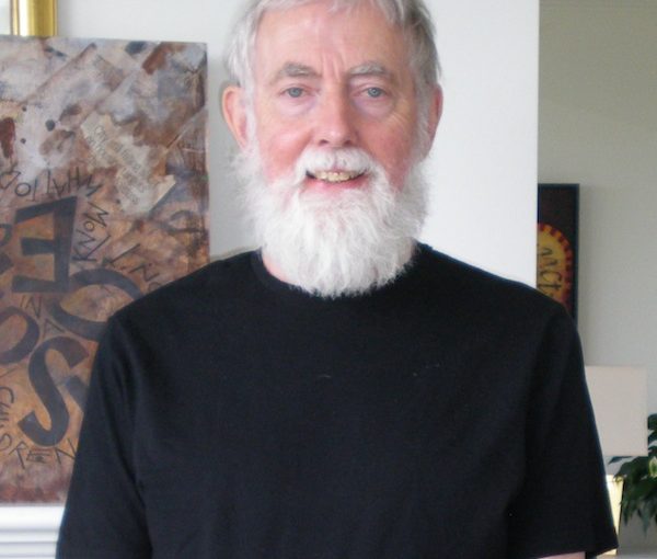
Ken Hughes infuses his paintings with messages. (photo by Olga Livshin)
Ken Hughes has always been fascinated with typography. “Since childhood, letters of the alphabet have intrigued me,” he said in an interview with the Independent.
“Public lettering is a centuries-old method of civic communication, both official and informal,” he said. “It goes back to Mesopotamia. By Greek and Roman times, public writing – inscriptions on buildings, commercial graphics, signs, epitaphs on tombs, graffiti – was common. The messages could be political or commercial, funerial or commemorative, religious or frivolous. In more contemporary times, particularly in Europe, public inscriptions have undergone a revival.”
The artist draws from this rich tradition for his paintings and his new show at the Zack Gallery, Ancient Writings in Contemporary Contexts, opens next week. A collection of inscriptional paintings, beautiful and evocative, colours and shapes of the images enhance and deepen the meanings of the lettering, and every piece tells a story.
Before retiring, Hughes was a professional graphic designer. He taught graphic design for years at Emily Carr and Kwantlen universities. He turned to art five years ago.
“Inscriptions – texts expressed formally or otherwise in different alphabets or languages – are a major source of inspiration for my paintings,” he said. “This particular exhibition’s goal is to visually express texts related to Jewish beliefs and culture. Some of the paintings have writings in the Hebrew alphabet. Others have transliterated Hebrew using the Roman alphabet.”
He explained that the messages in his paintings come from various sources: the Hebrew Bible, fiction and nonfiction by Jewish writers, as well as quotes by famous people, all related in one way or another to Jewish culture.
“I don’t speak Hebrew,” he said, “but I have friends who do. I always ask them to check the writing before I incorporate it into my paintings.”
In his work, the esthetics of the letters are intertwined with the message of the citation used. He has been collecting quotes, personal mottos, sayings and other forms of public texts for a long time. “I sing in a choir, and much of choral music is liturgical,” he said. “It has incredible messages, many of them in Latin. I also read a lot and get my messages from books, from newspapers, from common idioms.”
In 2002, Hughes took a yearlong sabbatical from teaching to prepare for what he does now.
“I traveled through Europe – Poland, France, Turkey, Belgium, Greece and Israel,” he said. “I took photos of the public inscriptions on civic buildings, in churches, at cemeteries. I wrote down quotes from illuminated manuscripts in national libraries. There are incredible inscriptions on the tombstones in Budapest, where many famous Hungarians are buried. Jewish cemeteries have beautiful inscriptions in Hebrew.”
Sometimes, a line of text or a quote stays in his memory or in his notebooks for decades before appearing in one of his paintings. Many of his pieces are sad, executed in a darkish palette, underscoring words of deep emotion: grief, fear, despair, memories of hard times and bleak thoughts. But there is hope and joy, too, and Hughes uses bright and colourful compositions to accentuate those messages.
One of his uplifting works, a multi-paneled cycle based on the story of Genesis, with Hebrew lettering dancing across the panels, is decorative as well as informative. The series will be in the exhibit at the Zack.
“Alphabets are amazing inventions, incredible almost,” Hughes said. “They allow people to communicate ideas with just a few symbols. And they are all different – the Roman alphabet, the Cyrillic letters, the Hebrew. In all cases, letters by themselves mean nothing; they’re just symbols. But a combination of letters, a phrase, could have profound meaning.”
When Hughes starts working on a piece, he approaches it as a designer, with a typographer’s attention to detail. He makes many sketches while investigating each idea. What colours should be employed and in what combinations? What is the best number of panels for this message and the most expressive configuration to highlight the meaning of the words? Even the font used can make a difference.
“Some letters look better in a rounded font; others need a blockier typeface,” he said. “The positioning of the letters and the words could be of paramount importance in my paintings. They constitute the composition. And, of course, the message itself often dictates the font type.”
There are not many artists in Canada who dedicate their art to this kind of painting.
“I wanted my paintings at the Zack,” Hughes said. “I don’t want to display at commercial galleries. I think my works are much more suited to schools, churches or community centres.”
Ancient Writings in Contemporary Contexts runs from July 25 to Aug. 25. To learn more, visit kenhughes-art.com.
Olga Livshin is a Vancouver freelance writer. She can be reached at olgagodim@gmail.com.

