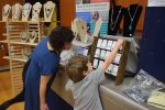
Joel Harrington chats with Ande Axelrod from Tagua, who makes jewelry from nuts grown in the Amazon (treatsdesigns.com), at a gathering of B.C. artisans at the North Shore Jewish Community Centre (Har El Congregation) on Oct. 16. (photo by Shula Klinger)
From the left: Zack Gallery’s Linda Lando and jewelry artists Julie Kemble and Barbara Cohen. (photo from Zack Gallery)
Just as our clothing defines us to some degree, so does the jewelry we wear. Our choices often reflect not only our likes or dislikes, but how brave we are and how adventurous. The current group show at the Zack Gallery, called Light, features a range of unusual jewelry, from stylish and graceful, to whimsical, to outrageous. Practically everything on display, with the exception of a couple of metal sculptures, could be worn, and the gallery supplies a mirror for those intrepid souls who dare to try the pieces on.
Presented by the Vancouver Metal Arts Association, the exhibit introduces jewelry made not only of traditional materials, like silver, but of many unorthodox materials and objects, some of which have never been considered for adornment, until recently.
“These pieces remind me of far-away places, of mystery and romance. Some of them – you need a large personality to wear,” said Julie Kemble, the association’s liaison for the show.
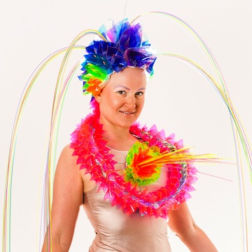
Zula, wearing her own creation, which is on display at the Zack Gallery. (photo from Zula)
According to Kemble, the show’s title, Light, invokes different interpretations. “We want to bring light into our works, into the lives of our artists and the people who wear our creations,” she said, adding that the association encourages artists to use alternative materials as well, like plastic or fabrics.
As did several other participants in the exhibit, Kemble started out as an amateur artist. She was a university teacher for many years.
“I always liked art,” she told the Independent. “At first, it was a hobby, but it is much more now. I began with textiles and gravitated towards metal and jewelry about 20 years ago. Metal allows a certain immediacy. You see right away what’s coming out of your hands.”
She explained that this show is the association’s fifth annual one and the second at the Zack. “We want to increase the profile of art jewelry in Vancouver,” she said. “That’s why this is a juried show. We invited the judges and jewelry artists from across Canada.”
Some of those artists are professionals, while others are taking their first steps on the artistic road. One of the beginners is Raymond Schwartz, but nobody would guess that by looking at his sterling silver necklaces. Elegant, sophisticated and relatively smaller than some other pieces on display, they represent a more traditional approach to jewelry.
“I’m brand new to jewelry,” he said. “I started two years ago. I’ve always been artistic, always liked doing things with my hands, but my business was construction. Now, I’m getting older, so I began making jewelry. It’s like construction, but making mini things. I also paint oils, but jewelry allows both creativity and working with my hands; it fills the void.”
This show is Schwartz’s first, although he has already sold some of his pieces.
Barbara Cohen, meanwhile, is a professional jewelry-maker with years of experience. “My background was in textile before I switched to metal. Now, I’m moving away from metal, too, using more of other materials,” she said. “I like the scale of jewelry. It is portable art.
“It’s also the most understated form of communication. When you wear a piece of original jewelry, it often starts conversations. I curated several jewelry exhibitions. Sometimes, I would wear a piece from the show, and people would admire it and ask me where it came from. They didn’t notice it in a display case but they noticed it around my neck. Jewelry should be worn. That’s why we have a mirror in the gallery, so people could see themselves wearing our art.”
Her necklaces, asymmetrical and quirky, draw the eye. Their patterns and textures make people wonder and try to decipher the artist’s ideas. They definitely start conversations.
Zula, also a professional artist, represents an extreme trend in jewelry-making. Her pieces, part of her new Neon Love collection, are a bright acrylic extravaganza, playful and flashy and fairly large. They use geometric shapes and are not for the faint of heart. It is a new development for the young artist, an experimental departure from her more traditional plant-patterned collection in silver and copper.
“I had a health crisis recently,” Zula explained. “I lost my hair to alopecia. Now I’m bald, but I chose not to wear a wig. I asked myself, what is my identity now? If I was a brunette before, am I still a brunette? I had this colourful plastic in my studio and I started playing with it. I needed to be edgy, and my new pieces provide that. They interact with light.”
Many other artists are part of the Light exhibit, which runs until Nov. 12.
Olga Livshin is a Vancouver freelance writer. She can be reached at [email protected].
On Sept. 25, a group of writers gathered to write and share poems sparked by the paintings of Waldemar Smolarek, now on display at Zack Gallery. (photo by Olga Livshin)
Poetry events at the Sidney and Gertrude Zack Gallery have become a regular feature in the last few years. Every couple of months, writers of Pandora’s Collective meet at the gallery to read their poems inspired by the art. They held their latest gathering on Sept. 25.
The abstract paintings currently on display at the Zack seem to have been created to inspire poetry. Waldemar Smolarek’s work is known to gallery patrons. Smolarek’s first show at the Zack, in 2012, was posthumous – he died in 2010 – but his art is alive, infused with vibrant colours and the artist’s unique frenetic energy.
Smolarek, a proponent of purely abstract compositions, filled his canvasses with dynamic currents. His lines, in every imaginable hue, fly like arrows. His multicoloured balls dance like polka dots. His vivid splashes of blue and peach flow into each other, seemingly at random, but there is logic in the twists and turns of the artist’s brush. His art invites people to delve into their own psyche, and the poets of the evening responded to the paintings’ visual challenge with a wide variety of works: long and short, light-hearted and lamenting. Some poems were inspired by one specific painting, while other rhyming flights of fancy encompassed the entire gallery.
As the event was a collaboration between the Zack Gallery and the Isaac Waldman Jewish Public Library, Helen Pinsky, the head librarian, gave a short introduction before passing the microphone to Leanne Boschman, the host of the evening.
Although it was her first time as host, Boschman has participated in the Zack Gallery poetry evenings twice before. “The first time, the exhibition included the artist’s journal and sketches, and I found it fascinating to see the artistic journey in progress,” she told the Independent. “The second time, it was a show of abstract photographs…. I like abstract art in connection to my poetry. I can play loosely with colours and shapes and words. It’s harder when the art shows specific people or places. With abstract art, the poet is free to follow her own associations. Sometimes, it’s a story; sometimes, a feeling or a question.”
Most of the participating poets agreed with her assessment, and Smolarek’s art was a rich source for many pieces. The audience, although not large, was extremely generous in support of anyone at the mic, both the listed readers and the brave volunteers who took part in the open mic portion of the event. The friendly atmosphere, combined with the bright paintings and Boschman’s humorous but factual introductions of every reader, made the evening a joyful celebration of colours and words.
The first poet who read, Suzy Malcolm, has been writing poetry since she was a teenager. “It’s my fifth time at the Zack,” she said. “I prefer abstract art for my poetry. It feels like a gift to write about colours and shapes.” She writes poetry for children as well as adults, and her poems at this event reflected both sides of her poetic endeavours.
Eva Waldauf, the next reader, started writing poetry when she was around 40. “I’m a visual artist,” she said. “Once, I had to write a poem for a class, and I liked it. I thought it was fun; thought, ‘I could do it,’ so I began writing poetry.” Her poems were not written on the spot. “I visited the gallery last week to see the paintings, so I would have time to write and edit my poems. I like to come prepared.” Although she admitted to always being nervous before reading her poems, one wouldn’t have guessed it from her performance. Her reading, relaxed and expressive, enhanced by expansive gestures, revealed a good actress as well as an original poet.
The next presenter, David Geary, staged his poems as letters to Smolarek. His presentation was comical. As if playing a game, he strode around the gallery and enrolled everyone in the audience and all the paintings as his willing and laughing playmates.
As a counterpoint to his irreverent show, Sita Carboni’s poetry resonated with mournful tunes. One of the co-founders of Pandora’s Collective, Carboni noted that, with art like Smolarek’s, a poet is free to explore in any direction. Her poetry, contemplative and deep, included a goodbye to someone she lost recently, and she couldn’t finish her reading because of the tears that choked her.
Warren Dean Fulton also prefers abstract art for his poetry. “Abstract art allows you to project your own feeling and emotions. It is speaking to your subconscious. The poet is much less free with portraits or landscape.”
Fulton has participated in the poetry readings at the Zack before. “It is interesting to hear how the same paintings could inspire such different interpretations,” he mused. As he likes to improvise with his poetry, he hadn’t seen Smolarek’s work before that evening.
The last poet of the night, Amanda Wardrop, is also an experienced writer and reader. A schoolteacher, Wardrop said she finds poetry everywhere: in her interactions with students, in figurative art and in abstract art. “Different poetry, that’s all,” she said. “Figurative art often results in a narrative, while abstract art pushes one to a more emotional response.” She did her research before coming to the reading that night, and her poetry touched on the artist’s technique: layers and textures, as they related to our lives.
The night concluded with a lively musical performance by Kempton Dexter, who played his guitar, sang and joked to the delight of the audience.
Olga Livshinis a Vancouver freelance writer. She can be reached at [email protected].
***
Balls collide and come apart,
Lines zigzag and soar,
Feeding moxie to my heart
Fields awash with colour.
Reds and blues and greens explode
Shards and doodles frolic,
Polka dots in quirky mode,
Joyful and symbolic.
– Olga Livshin, inspired by the artwork of Waldemar Smolarek
“Pomegranate Tree” is a fine art print of an original watercolour by Yael Berger. It is inspired by traditional folk art paintings. Pomegranate trees are actually big bushes, and their shape has inspired a lot of textile and illustration. Pomegranates symbolize plenty, wisdom and fertility, and the fruit is one of the symbols of Rosh Hashanah. The original painting was sold.
Berger is an Israel-based textile designer. After graduating from Shenkar College of Engineering, Design and Art in Ramat Gan, she worked in the fashion and home textile industry for more than 20 years, had her own design studio and sold funky printed T-shirts. Then she worked for 16 years as a senior sock designer and stylist at Delta Galil Ltd., a leading company of socks and underwear.
Her greatest passion is for colour and pattern, which is reflected in the name of her shop, the Joy of Color. “I hope my optimism and the joy I feel when creating is reflected in my paintings and prints,” she writes. “Nature, everyday objects and folk art inspire me and make me happy. As a minimalist at heart, I try to keep the shapes as simple as possible and let the colour speak. I do hope that my work will bring you joy and happiness.”
Artist Iza Radinsky at Zack Gallery. (photo by Olga Livshin)
Just over 500 years ago, in 1516, the Venetian Republic forcibly moved 700 Venetian Jews to an island, the abandoned site of a 14th-century foundry. In doing so, they created the first ghetto. The word ghetto means “foundry” in the old Venetian dialect.
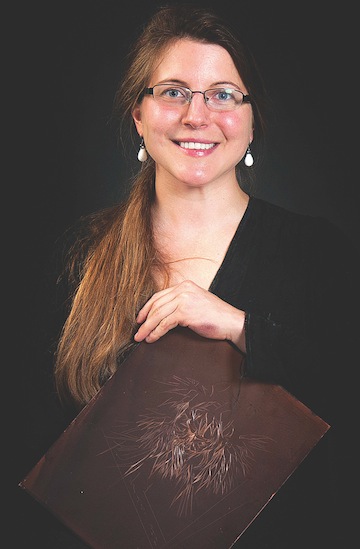
Rachel Singel (photo from Rachel Singer)
The Venetian ghetto had two access bridges, both guarded at night, and boats also patrolled the canals. Despite the isolation and other restrictions, the republic was relatively tolerant. Inside the ghetto, Jews were free to practise their religion and traditions; they were not forced to convert, as was the case in Spain and many other places throughout Europe. The ghetto became known as a place of study and scholarship, and its population grew from 700 in 1516 to more than 6,000 a hundred years later. The area – which existed until 1797, when Napoleon conquered the republic and gave equality to all citizens – remains a centre of Jewish culture.
Many Jewish and Italian organizations in North America and Europe have commemorated the 500th anniversary of the Venetian ghetto in some way. Here in Vancouver, Zack Gallery, in conjunction with Il Museo at the Italian Cultural Centre, are presenting Stories from the Stones of Venice: The Art of Rachel Singel and Iza Radinsky. The exhibit was the brainchild of Singel, an artist, printmaker and assistant professor at the University of Louisville, in Kentucky.
“The year 2016 marked the 500th year since the establishment of the Jewish ghetto in Venice,” she said in an email interview with the Jewish Independent. “To honour the historical anniversary and the influence of this uniquely urban space, I worked onsite in Venice for two months to create a series of etchings illustrating the buildings, structures and streets of the ghetto.”
That was not Singel’s first visit to Venice. “I first went to Venice in 2012 for an artist residency,” she said. “I have had the opportunity to return to Venice every year since. My artworks have been increasingly influenced by Venice and its fragile state…. The last two years, I have also brought my students to the Scuola Internazionale di Grafica Venezia.”
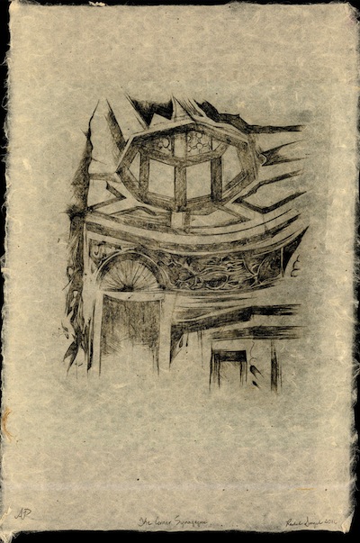
“The Corner Synagogue” by Rachel Singel. (photo from Rachel Singer)
Singel has exhibited her 10 ghetto prints at the international school and at the Jewish community centre in Louisville.
“Each of the 10 images seeks to call attention to the Venetian ghetto’s importance, not only as an architectural complex within the confines of Venice, but also its worth internationally. Its structures are resonantly symbolic, representing the community’s resolute will to survive and prosper in what was an exceedingly hostile social environment.”
When Singel heard about the exhibition that was being planned at Il Museo – The Venetian Ghetto: A Virtual Reconstruction 1516-2017, which opened on July 25 – she looked into the possibility of engaging with their event. “I reached out to the Zack Gallery director, Linda Lando, about exhibiting my prints at the JCC,” Singel said.
Lando liked the idea of a Venice exhibition, but 10 small prints were not enough to fill the Zack, so Lando invited Radinsky, a local artist, to exhibit her paintings of Venice in the same show.
“Linda Lando saw five of my paintings of Venice before,” Radinsky said. “She asked me if I had more and if I would like to participate in a two-artist show together with Rachel Singel. I was happy to.”
Radinsky’s 14 large paintings and Singel’s prints form the Zack exhibit.
“I love Venice,” Radinsky said. “I first visited it in 2006, with my 86-year-old father. I was awed by the city. It was as beautiful as in the old masters’ paintings I admired as a child in the museums of Moscow and St. Petersburg, even better. Afterwards, every time I go to Europe, I visit Venice. It draws me. It’s quiet there, no cars. People walk and gondolas float on the canals. Nothing artificial, just earthy colours, red roofs, water and sky – and reflections in the canals.”
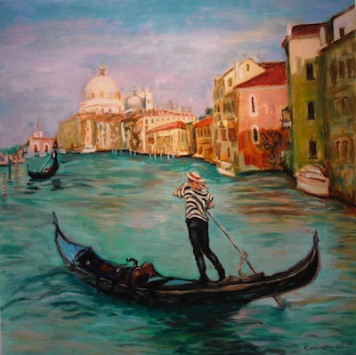
“Gondolier” by Iza Radinsky. (photo from Iza Radinsky)
In her paintings, gondolas and gondoliers look as intrinsic to the ancient city as the sunlight and shadows, the unique water streets and multiple bridges of Venice. The muted colours coalesce into one another, creating combinations that have no names. The sky and the water blend together, weaving one fantastic, living canvas.
“Venice is built on water,” Radinsky explained. “Because of the dampness, it’s hard to maintain the paint of the outside walls of the buildings. The paint often flakes off, and green mold grows close to the water. But gondolas – those look luxurious. Lots of gilt and bright colours, golden ornaments and lush fabrics and cushions for the passengers. Every gondola is an amazing piece of art. In the past, gondolas were part of the Venetian fleet. They could ram into an enemy ship, and their sharp iron bows could cut like knifes. Now, they are tourist attractions, and gondoliers are very friendly and knowledgeable. They wear special hats and traditional striped shirts. They have to study long and hard to learn manoeuvring in the narrow canals. They have to pass an exam and get a licence.”
The artist’s eyes glowed with enthusiasm as she talked about her beloved Venice. “I’ve been there four times already and I want to go again,” said Radinsky.
Stories from the Stones of Venice opened at Zack Gallery on July 27 and continues until Sept. 3.
Olga Livshinis a Vancouver freelance writer. She can be reached at [email protected].
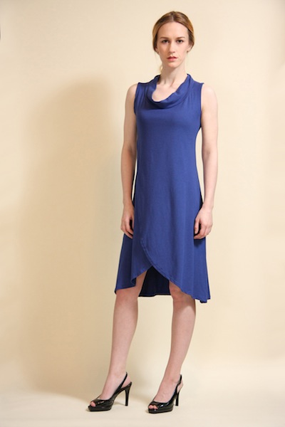
Israeli designer Yifat Jovani sewed clothes for her Barbie doll as a child, but didn’t launch her own fashion line for women until she moved to Vancouver 11 years ago.
Love brought the mother of two to the city. She met her Canadian husband, Tim Matheson, in Tel Aviv and the couple lived there for four years before relocating to British Columbia.
Yifat Jovani’s creations are feminine, elegant and pragmatic, with stylish, flowing layers that flatter the figure. (photo by Tim Matheson)
“My parents taught me that art should be a hobby, not a living, so, for many years, I never had the idea or the courage to make my clothing designs a professional business,” Jovani told the Jewish Independent. “Once we moved here, I realized it’s what I wanted to do.”
Jovani designs women’s clothes in sizes 2 through 12, all of them made from bamboo fabric. Her garments are feminine, elegant and pragmatic, with stylish, flowing layers that flatter the figure. They include tunics, dresses, coats, skirts and tops that can be dressed up or down depending on the occasion. “I like to call my designs clothing for real women, because that’s who wears my clothes – not skinny girls,” she reflected. “My clients are real women who have bodies in different shapes and sizes, and they need clothes that are practical, easy to care for and to travel with.”
Pragmatism is a key word for Jovani, who believes women shouldn’t have to suffer to look beautiful. “With my designs, you can multitask and still look beautiful,” she said. “Wear it to the office, and add an accessory to use it for dinner out or a cocktail party. I think women should have garments in their closets that aren’t just for special events.”
As part of her “real woman” design strategy, Jovani has asked her friends and clients to be her models at the fashion show events she organizes each year, and the feedback has been overwhelmingly positive. “People are telling me, it’s so nice to see how your clothes look in size 10. It makes it more real. And … when I do my photo shoot for my fall collection, I’ll feature a regular model, but I’ll also have a size 10 model.”
Jovani’s designs are available for sale at her online store, yifatjovani.com, and in Vancouver at the boutique Tenth & Proper (4483 West 10th Ave.) and at Kali (1000 Commercial Dr.). They are also selling at boutiques in Duncan, Courtenay, Terrace and Whitehorse. “I’m trying to get into more stores but I’m doing all this myself, and I have two little ones in the house ages 4 and 7,” she said. “My goal is that my clothing will sell in more stores, both in Canada and internationally.”
When asked how challenging it is to be a fashion designer in Vancouver, Jovani’s succinct response encapsulates her determination and drive to succeed. “It’s not about location, because everywhere in the world there is competition,” she said. “In order to succeed, you need to work hard for what you love, be determined, and believe in yourself. If you don’t take action, you don’t get results.”
Visit Jovani’s studio at Muckabout Gift Gallery, 4759 Hastings St., or make an appointment to see her by emailing [email protected].
Lauren Kramer, an award-winning writer and editor, lives in Richmond. To read her work online, visit laurenkramer.net.
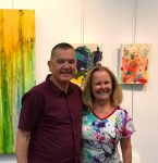
Artists Michael Abelman and Victoria Scudamore share the walls at Zack Gallery in the exhibit Sea to Sky. (photo by Olga Livshin)
In the exhibit Sea to Sky at Zack Gallery, the artists’ works complement each other. Michael Abelman’s seascapes and floral compositions lean towards the pensive and are a little wistful, while Victoria Scudamore’s abstract paintings add splashes of colour and joy to the gallery walls.
“I’ve always liked crafts, since I was a child,” Scudamore said in an interview with the Independent, “but I could never draw. I was a realtor for 30 years. Then, seven years ago, I fell off my bike and broke a wrist. A month later, I decided to take an art class. I thought: I couldn’t draw anyway, I would just have fun.”
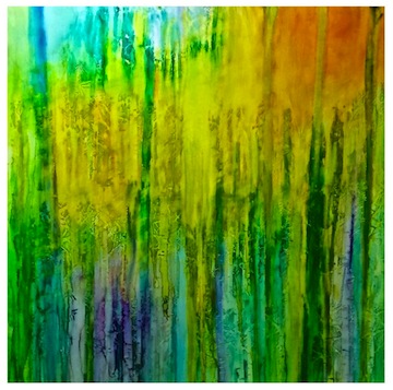
“Chakra Forest” by Victoria Scudamore.
She did have fun. But, also during that class, she discovered the style of intuitive, abstract painting and fell in love with it. “It resonated with me,” she recalled. She started taking more classes. “Art became a real passion of mine,” she said. “Now I have to paint every day. I don’t feel whole if I don’t paint. This is my first show, and I’m very excited about it.”
Her elation is unmistakable as she talks about her creative process.
“I’m an abstract expressionist. I try to capture emotions in my paintings,” she explained. “I want to show movement, colours in motion, to show connections. To paint abstract, I need to be in a dreamy space. I often listen to ’70s rock music and sometimes I dance when I paint. Once, I accidentally knocked off a bottle of ink onto one of my paintings, but I didn’t throw it away. I saw something in the pattern of the ink stains and painted over it, used it.”
Scudamore feels adventurous in her approach to art, ready to respond to any stimulus, be it a forest, a seashore, a flower, a bird, an ink stain or a stray thought. “I often paint two paintings at a time,” she said. “I feel freer to explore this way. Like a scientist, I experiment with colours, shapes and textures. Sometimes, I fall in love with a certain palette and do a series based on those colours. It’s all intuitive. I never know where I’ll end up when I start a painting. The beginning is the most exciting moment for me, a mystery. I’m child-like when I paint. I’m in the realm of fun.”
Her happiness in creating art makes her brave and self-confident. “I don’t compare myself with other artists,” she said. “Sure, Michael [Abelman] has been painting for 20 years; he has much more experience than I do, but I think artists shouldn’t compare with each other. It steals joy. We are all on different paths, our own paths.”
Abelman agrees with that sentiment. “I’ve been painting for 20 years but only showing for five years,” he said. “Like Victoria, I don’t compare myself with other artists, only with myself. My art is changing, evolving.”
Sea to Sky is Abelman’s second show at the Zack. His solo show in 2014 was a rainbow explosion of flowers but, this year, his paintings demonstrate a different level of maturity. Although half of his paintings are still flowers, their colours are more pastel and the ambience more contemplative. “It feels like another stage in my art and in my life,” he said. “Maybe I’m getting older.”
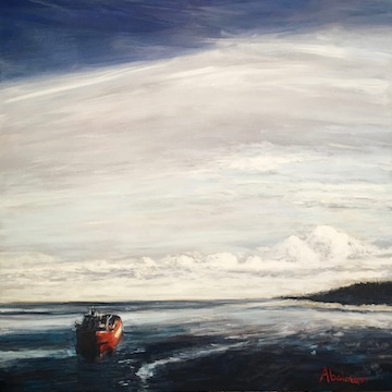
“Red Ship Entering Bay” by Michael Abelman.
Half of his exhibited paintings this year are ships: in winter and in summer, in the morning mist and in the glowing sunset. “I painted ships before but, recently, I find myself drawn to them. My ship paintings are quiet, while the flowers are always louder, exuberant with colours. I still paint flowers, but I wanted more. If you could find beauty in a tulip you could find beauty in a ship, too. I wanted to show it.”
Abelman said ships reflect a sense of exploration but also of loneliness. “A ship is always alone amid the vast ocean, and even near the shore,” he said. “You could see lots of ships in Vancouver. They arrive and depart daily. I take pictures of them when I walk along the waterline, then I take different things from different photos for my paintings.”
He constantly works on improving his skills and widening his range of expression. “Professionally,” he said, “I’m an accountant, but I never tried so hard in accounting as I do in art; never enjoyed accounting so much either. In art, I’m driven. I want to succeed, to be better. I don’t care if I sell, but I want to paint better. I’ve been taking art classes for years, and the more I learn, the more I realize how much I still need to learn.”
Like Scudamore, he paints every day but, unlike his partner in the show, his deep immersion in art doesn’t come easily. “Painting is hard for me,” he admitted. “You go into your own world for hours at a time. It’s a form of meditation. I have to focus, so no music for me when I paint. Sometimes, I listen to the news, but mostly I concentrate on my art.”
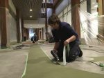
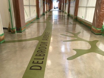
In spring 2014, an open call was circulated inviting artists to submit proposals for artworks to be included in the new Delbrook Community Centre in North Vancouver. In response, 64 artists from across Canada and the United States submitted expressions of interest. Among the few chosen was Mia Weinberg’s “Close to Nature’s Heart.” The official opening takes place at the community centre June 24, but visitors can see it at the centre anytime.
Weinberg’s “Close to Nature’s Heart” transforms the floor surface of the centre’s main lobby level and adjoining exterior plaza into a giant canvas. A unique cement skimming process was used to embed the image of a magnified leaf skeleton, complete with stem and veins, across the polished cement floors. The artwork invites visitors to “come in and play,” as many of the leaf veins display the names of local streets. For newcomers to the facility, the street names provide a visual prompt to navigate through the space.
As an artist specializing in site-specific public art projects, Weinberg is driven by the belief that art has the potential to make us more present and engaged in our world. Born in London, England, she moved to Vancouver in 1987 and graduated from Emily Carr University in 1994. Since that time, her work has been exhibited across Canada and internationally. Her art practice explores the interplay between the natural environment and the places where we live, our personal memories and our collective civic and cultural stories.
“In my public art projects,” writes Weinberg in her artist’s statement, “I often juxtapose imagery of local plants and maps of the surrounding area to celebrate connections between them, and to uniquely ground each piece in the place where it will be installed.”
About “Close to Nature’s Heart,” she explains, “The big leaf on the floor is a fanciful approximation of reality, not a realistic street map – a visual invitation to engage the imagination. Children, their parents and visitors of all ages will see the individual components of their neighbourhood – the streets where they live – reimagined as vitally connected to each other and part of a living, thriving organism that draws its strength from each individual part and in turn nourishes the whole. It is my hope that the artwork will spark an ongoing sense of play among kids as they seek out their own streets and their friends’ streets. On a more practical level, the veins will provide visitors with a subtle and beautiful visual wayfinding that will guide them into and out of the building and to the reception desk from the elevators.”
For more about Weinberg’s public artwork, visit miaweinberg.com/engraving. For information on the other two works selected by Delbrook Community Centre, visit nvrc.ca.
Gail Dodek Wenner conceived the group exhibit Physician Heal Thyself … and Others, which is at Zack Gallery until June 25. (photo by Olga Livshin)
The new exhibition at Zack Gallery, Physician Heal Thyself … and Others, includes four artists, all of them local physicians near retiring or recently retired. Regular visitors to the gallery probably will be familiar with the work of two of them – Ian Penn and Carl Rothschild, who have exhibited at the gallery before – but maybe not that of Arturo Manes and Gail Dodek Wenner.
Rothschild’s contribution to the show is a selection of small, colourful paintings, which look like snapshots of his garden or a street around the corner. Each one is accompanied by a poem written by the artist. Together, they represent his impression of his home city and its healing potential.
“Preventative Medicine” by Carl Rothschild. (photo by Olga Livshin)
Penn’s part of the show is more dramatic. It includes a video and several photographed pages from his journal, where he documented the before and after of his complicated spinal surgery in 2016. His display fits the theme of the show almost too perfectly for comfort.
Manes’ paintings – his method of spiritual healing – are based on Roman Vishniac’s book of black-and-white photographs, A Vanished World.
“The Shoah has been for me a defining event not only in Jewish history but human behaviour, which I’m trying to come to grips with,” Manes said in an email interview. “Black-and-white photographs in Vishniac’s book impressed me greatly…. I used those images of my people prior to the Holocaust as a template for my paintings. By adding colour and a free rendering, I hoped to express the feelings the photographs have evoked.”
He said Physician Heal Thyself is the first exhibit in which he has participated, although he has been painting since childhood. “I’m not an artist – I’m a physician who paints. I was honoured to be invited by Dr. Gail Wenner to be a part of this show.”
Dodek Wenner invited the other doctors to participate in the show, as well. It was she who came up with the theme.
“I always loved art, but I loved science, too,” she told the Independent. “I chose medicine as my career, but art has always been my hobby.”
As an artist, she is very versatile. At one point or another, she has tried various media: painting, ceramics, textiles, photography, Hebrew calligraphy. In practising medicine, however, she stayed true to one direction: mothers and babies. “In the past 26 years, I delivered 2,000 babies,” she said. “But I made the decision to stop delivering. It’s time for a change.”
One of the precursors of her decision was going back to school, to Emily Carr University. In 2009, she received a diploma in fine art technique.
“Weaver” by Arturo Manes. (photo by Olga Livshin)
“I took a class, Business of Art,” she recalled. “One of the assignments was to pitch an idea for a show to an art gallery. I chose a theme: healing, what it means to be a doctor and what Judaism says about healing. I chose the Zack Gallery, and I decided to invite several Jewish physicians to participate. All for a school assignment. I didn’t actually do it at that time. I did mention it to Yosef Wosk, who is a friend, and he said it was a great idea.”
A few years later, Wosk reminded her of the idea, and she finally contacted Zack Gallery director Linda Lando. “I pitched the idea to Linda in 2016,” Dodek Wenner said. “We brainstormed it and came up with a few names of Jewish physicians who were artists.”
That was the first step. The next step was to determine what she wanted to paint for the show. “I needed to explore what healing meant to me,” Dodek Wenner explained. “Personally, I always went to my parents’ beach house when I needed to do some healing. So, I thought, what was it about the ocean that healed me?”
After some contemplation, she came up with four steps of healing. “The first one is the acknowledgement: yes, there is a problem. There is a fear, and a doctor has to acknowledge that fear in her patient. Next comes compassion, which leads to the doctor assuring her patient: I can help you. The third one is wisdom. Doctors have a huge body of knowledge. They study for many years, and they share their knowledge with the patient, use what they know for healing. Last is comfort. Comforting the patient is very important at every stage of the healing process.”
After formulating these concepts in her head, she explored what Judaism says about healing. “I looked in the siddur, the Jewish prayer book, and found all four of those concepts of healing, both body and soul, in the first couple pages,” she said.
She knew she was on the right track but wasn’t sure how to showcase her ideas through art. “I went to the beach house again, walked along the shore, and I knew,” she said. “The ocean represents all four facets of healing, too.”
Her paintings, two distinct series of five paintings, are all different interpretations of the shoreline. The ocean is sometimes quiet, sometimes turbulent and the colours of the waves fluctuate from light blue to deep green. The foam, created with the use of medical gauze, plays in the sand among the shells. The shells are real, collected by the artist along the same beach she loves so much. “I scooped them with a cup,” she said.
“My paintings don’t show one particular place,” she added. “They are the essence of a shoreline. Each piece is different, but they all connect.”
Physician Heal Thyself opened on May 25 and continues until June 25.
Olga Livshinis a Vancouver freelance writer. She can be reached at [email protected].